The evaluation for my coursework can be found at the following address: http://jameskay1996.wix.com/jky13
I decided to create a Wix website for my evaluation so that it is easier to read through than looking at individual blog posts. Also images and videos can be more easily embedded into Wix.
James Kay Y13 Portfolio (7361)
Sunday, 30 March 2014
Main Task - Magazine
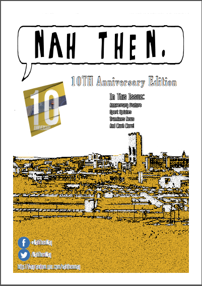
After receiving some feedback I have made a slight few changes to my magazine. These changes include the following:
- Increased the "Nah Then" title to add more emphasis to it.
- Added page numbers at the bottom of each page in a speech bubble (only on anniversary special pages)
- Added website link near the social media links on the front cover
- Added speech bubbles to the anniversary page which add emphasis to a certain line within the written text.
Saturday, 29 March 2014
Ancillary Task - Website Updated
With all of my work that I have created it is important that I make improvements before finally regarding it as a final version. With my Ancillary Task I decided to ask for some advice from fellow classmates and I also my subject teacher. Everyone's input was extremely useful as we live in an age where we all use the internet so everyone in the class could quite easily tell if it was an effective website. The following feedback was given and these changes were made accordingly:
- The webpages contain a lot of white space, this made the webpage very boring for the user. I changed this on my updated website by adding the murky grey style background which is found on my billboard advertisement. I also decided to keep the repeat the theme of speech bubbles and add them to blend into my website by meshing them around the text I had.
- Too many pages. My subject teacher reminded me that in the checklist I only needed to have two webpages. I chose to keep the text I had on my extra page and merge the About Us and Latest Issue pages together.
- Added the same Facebook and Twitter design images to follow with the house style of my work.
My updated website can be found at the same address here.
Friday, 21 March 2014
Media Evaluation - Notes
Before I started writing my evaluation I began writing notes within class while talking with my teacher to give me a thorough understanding on what exactly I was writing for my evaluation. These notes can be found below:
Wednesday, 19 March 2014
Ancillary Task - Billboard Updated Version
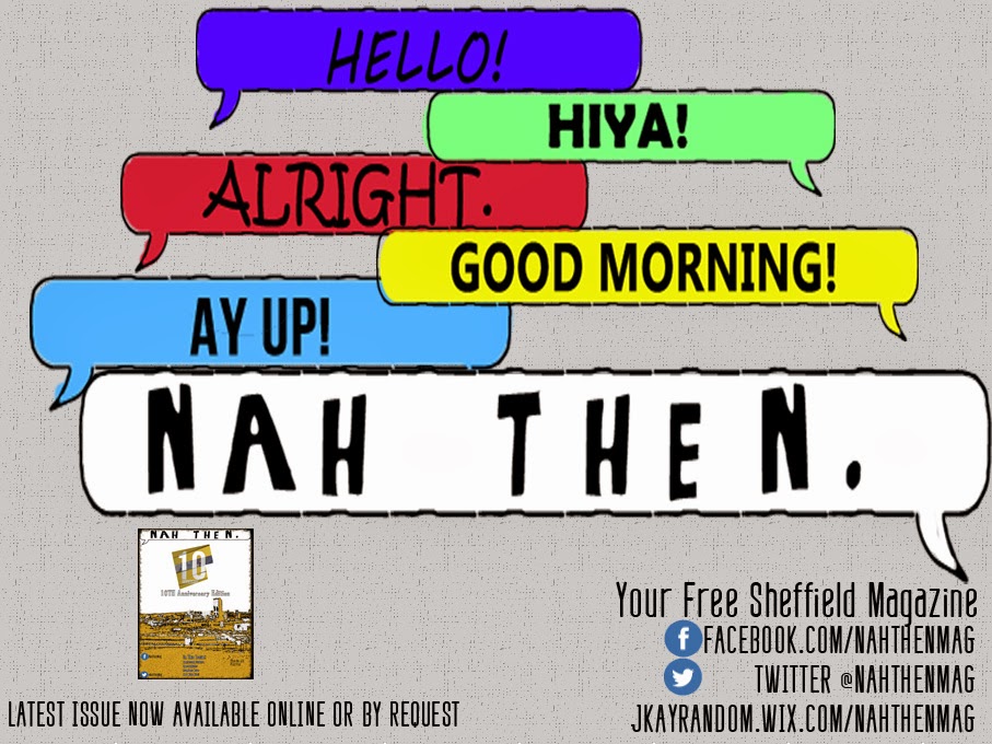
After receiving feedback for my Billboard Advertisement I have decided to make changes based on the feedback I was given. Some of these were the following:
- Changed the font style for some of the other greetings other than "Nah Then". This was done to distinguish between the other greetings and the make the magazine title stand more.
- Made the "Nah Then" text bigger. This was again to make it stand out more from the other words to make sure the reader understands that "Nah Then" is the main focus of the advertisement.
- Added a screenshot of my magazine cover to show the audience my latest issue. This was an improvement suggested to me by my Media Teacher and also fellow students in my class.
- Added more social media and website links to help follow the house style, by adding these links it makes the advert and other work such as the magazine and website seem more like part of the same ecosystem.
I then asked for some final feedback on my work for some small improvement. I was suggested that I increased the size of each speech bubble, maybe even so they overlap in order to fill up some of the blank gaps between them. I also added the same Facebook and Twitter Logo that is found on my front cover in order to help with continuity and house-styles. Finally I also added a bit more text on where to find my magazine.
Tuesday, 11 March 2014
Main Task - Magazine
The following images are from my completed regional magazine task. The PDF document for the magazine can be found within the regional magazines website. This version isn't likely to be my final version as I will be receiving user feedback so that I can further improve my work to make it as good as possible.
Monday, 3 March 2014
Ancillary Task - Billboard Advertisement
As the other Ancillary Task I have chosen to create a Billboard Advertisement. Earlier Blog posts show the research I went into to look at existing examples of Billboard advertisements which gave me ideas and inspiration for my own. When creating the Billboard the advertisement it was important that I continued with my use of a house style, because of this I have used fonts that have been recurring throughout my work, with the main emphasis on the font used for "Nah Then". The advert is a simplistic design, the main focus is the distinguished "Nah Then" which is in white to stand out from the other words, this is to distinguish the fact that the other greetings are rather generic British greeting whereas "Nah Then" is a greeting which is found in Sheffield, which is where my magazine is based.
Subscribe to:
Posts (Atom)


