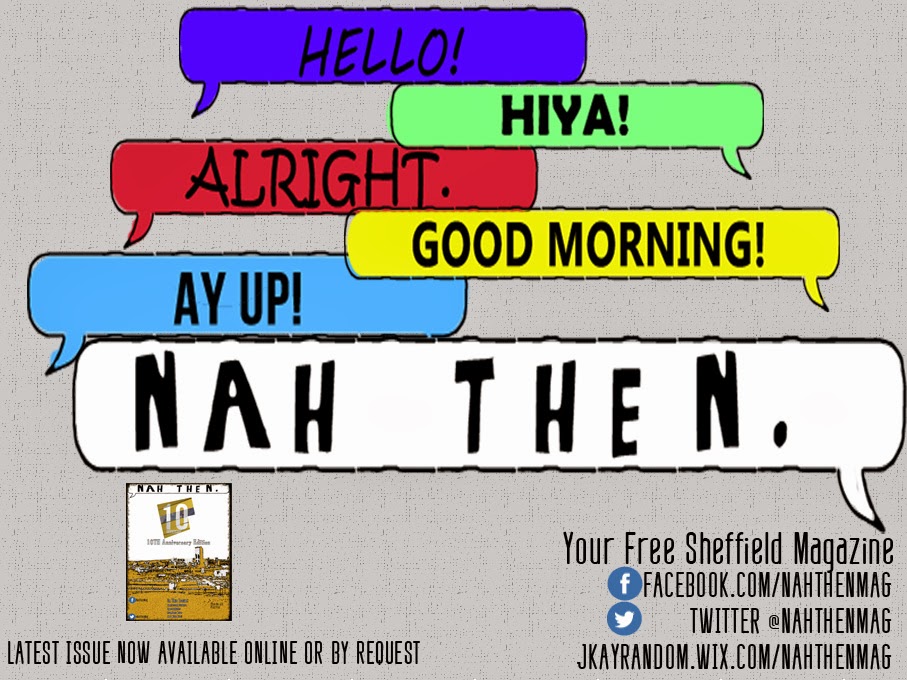
- Changed the font style for some of the other greetings other than "Nah Then". This was done to distinguish between the other greetings and the make the magazine title stand more.
- Made the "Nah Then" text bigger. This was again to make it stand out more from the other words to make sure the reader understands that "Nah Then" is the main focus of the advertisement.
- Added a screenshot of my magazine cover to show the audience my latest issue. This was an improvement suggested to me by my Media Teacher and also fellow students in my class.
- Added more social media and website links to help follow the house style, by adding these links it makes the advert and other work such as the magazine and website seem more like part of the same ecosystem.
I then asked for some final feedback on my work for some small improvement. I was suggested that I increased the size of each speech bubble, maybe even so they overlap in order to fill up some of the blank gaps between them. I also added the same Facebook and Twitter Logo that is found on my front cover in order to help with continuity and house-styles. Finally I also added a bit more text on where to find my magazine.


No comments:
Post a Comment