Thursday, 19 December 2013

Planning - Front Cover Image

In the task I have been given it is mentioned that I must use original images taken by myself and not from external sources such as the internet. As I am reaching the planning stages of my coursework it is important I start to think about the different images I can use in my front cover and if they are going to be suitable.

Image focused on an individual(s)

Some magazines often feature certain individual or a group of people, this is often used to help show the reader that the featured article within the magazine may include these individuals. The image is often one in which the reader can clearly see the individual, they are often centred in the middle of the page in order for the reader to focus on them and not the backdrop of the individual. The image may contain a subheading which is linked into these particular individuals.

An example of this can be seen in the Exposed front cover below. The two men are clearly the main focus in the image, with the text "Public Service Broadcasting"could possibly refer to a band in which the individuals are members of.


For my regional magazine an idea which I had for this could be an individual who has recently become a lot more famous stood near an iconic Sheffield Landmark. The article inside would focus upon the individual returning back to their home city of Sheffield and would include information on their career but also their childhood memories they had in Sheffield.

Image focused on parts of the environment such as a famous building

Instead of using individuals may also use certain landmarks or locations to help suggest that the content within may refer to that particular landmark/location. This is similar to using an individual but instead of the content being about a person it often refers to the location in question. These aren't often that common in comparison to using individuals on a front cover however in certain circumstances such as certain buildings being renovated, changed or removed they may decide to write an article focusing on it.

As my magazine is based in Sheffield the places I would use on my front cover would come from areas within Sheffield. An idea I had for this could be an anniversary issues such as a one year anniversary of the magazine. The front cover would consist of a collection of images taken from Sheffield which are slightly edited with effects. Images could include areas such as the Crucible, Park Hill Flats, Meadowhall and many more.


Images taken from external sources to show which areas I could use, for the front cover I will use images I have taken myself:
http://www.theguardian.com/artanddesign/2011/aug/21/park-hill-sheffield-renovation
http://commons.wikimedia.org/wiki/File:Sheffield_Crucible_theatre.png
http://www.geograph.org.uk/photo/1994609

Tuesday, 17 December 2013

Planning - Colour Symbolism

The colours which I use within my magazine can have many symbolise many different things therefore it is important i take this into consideration when choosing which colours to use for my magazine.

I found the following article online to help me find out more: http://www.smashingmagazine.com/2010/01/28/color-theory-for-designers-part-1-the-meaning-of-color/ 

Warm Colours

Warm colours include red, orange, and yellow, and variations of those three colours. These are the colours of fire, of fall leaves, and of sunsets and sunrises, and are generally energising, passionate, and positive.
Red and yellow are both primary colours, with orange falling in the middle, which means warm colours are all truly warm and aren’t created by combining a warm colour with a cool colour. Use warm colours in your designs to reflect passion, happiness, enthusiasm, and energy.
Cool Colours
Cool colours include green, blue, and purple, are often more subdued than warm colours. They are the colours of night, of water, of nature, and are usually calming, relaxing, and somewhat reserved.
Blue is the only primary colour within the cool spectrum, which means the other colours are created by combining blue with a warm colour (yellow for green and red for purple). Greens take on some of the attributes of yellow, and purple takes on some of the attributes of red. Use cool colours in your designs to give a sense of calm or professionalism.
Neutral Colours
Neutral colours often serve as the backdrop in design. They’re commonly combined with brighter accent colours. But they can also be used on their own in designs, and can create very sophisticated layouts. The meanings and impressions of neutral colours are much more affected by the colours that surround them than are warm and cool colours.
To Summarise:
  • Red: Passion, Love, Anger
  • Orange: Energy, Happiness, Vitality
  • Yellow: Happiness, Hope, Deceit
  • Green: New Beginnings, Abundance, Nature
  • Blue: Calm, Responsible, Sadness
  • Purple: Creativity, Royalty, Wealth
  • Black: Mystery, Elegance, Evil
  • Gray: Moody, Conservative, Formality
  • White: Purity, Cleanliness, Virtue
  • Brown: Nature, Wholesomeness, Dependability
  • Tan or Beige: Conservative, Piety, Dull
  • Cream or Ivory: Calm, Elegant, Purity


  • Thursday, 12 December 2013

    Planning - Magazine Name

    I decided to create a digital mind map regarding the ideas I had for my magazine name. The mind map below is interactive and has notes and links to websites if you hover the mouse over certain aspects. I will evaluate some of these names and then decide on a final name at a later date.


    Create your own mind maps at MindMeister

    Wednesday, 11 December 2013

    Planning - Magazine Layout and Design Plan

    I decided to create a layout and design plan for my magazine layout in order to help in the production of my magazine.  I will refer back to this design during the production of my magazine instead of trying to create it on the spot as it can cause problems with things such as continuity.


    Tuesday, 10 December 2013

    Planning - Magazine Layout Information

    A key aspect to think about during the planning of my product is the layout and design. I found the following website to help me in regards to magazine layout.
    http://inspirationhut.net/articles/what-makes-a-good-magazine-layout-the-honest-opinion/

    In the website the article has helpful information especially on the layout of magazines, as I am a media student my knowledge on magazine production will be nowhere near a professional level, therefore the example layout images have really helped me in basing the layout of my own magazine. I will definitely apply a similar structure type to the one seen below (taken from the article):

    Thursday, 5 December 2013

    Researching Similar Products - Magazine Websites

    To conclude my research on similar products I have chosen to research Magazine Websites as it would be a product I will be creating in my ancillary task. Magazine Websites are very today with the internet expanding at the rate it is. Most reasonably well known Magazines now have Websites which help advertise and show extra content for their magazine. Websites allow magazines to extend their advertising to the internet instead of just billboard advertisements and word of mouth. I will be researching two pages of each website as that is the amount I am required for my ancillary.

    Exposed Magazine

    Home Page


    News Page
    Conclusion

    Overall I believe that Exposed's Website is a good but not amazing Magazine Website. I found the initial home page was a good representation of the magazine as it followed all the same house style and graphics. It also had easy navigation and it was clear to see the different categories which Exposed Covers such as News, Music, Movies, Fashion, Food and Drink and more. With these categories however it shows that Exposed may have gone too far in what it is trying to achieve, most regional magazines don't cover these categories in such detail therefore it may mislead the reader into believing that it is not a regional magazine and instead an entertainment/music magazine. The news webpage which I also looked into however wasn't really as good as the home page. The webpage was very similar to the home page with the small images and description beneath, however the webpage seemed very bland and nothing really stood out. The most disappointing of Exposed's Website is probably the amount of content on the side such as the Spotify Playlist and Soundcloud links, the content seemed very cramped and unneeded which added clutter to the website which I found off putting. When I design my Website I will make sure it is much more simple than this.


    Active8 Magazine

    Home Page

    Company Background Page

    Conclusion

    The webpage which Heron Publication offers for Active8 readers is much more of an informative basic website than the website which Exposed offers. Active8 is a very stripped back basic website which doesn't consist of much interactive content like Exposed does. Even though there is not much to offer within Active8s website I feel that it does a good job in being an informative website for the magazine. It is worth considering that the reason Active8 is an effective website in what it does is because it doesn't need to be a big entertainment based website, if the website was like Exposed with the music videos and Spotify playlists it wouldn't be a good representation of what the magazine is actually like. I feel the key with Magazine websites is that they should represent what the magazine is really like, if not this can lead to confusion and disappointment when people expect a magazine to be similar to the website they are viewing.


    How this affects my product

    By me researching these websites it has shown me two completely different types of magazine websites. The basic, information based website (Active8) and the heavy on content interactive website (Exposed). I feel for my magazine website it would be suitable for me to use aspects of both, it needs to contain information but also needs to be a bit more pleasing for the eye like Exposed.


    Tuesday, 26 November 2013

    Researching Similar Products - Billboard Advertising

    As part of my ancillary task I must also create a billboard advertising design and also the first two webpages for a regional magazine website. In regards to the billboard advertising I decided to look into trying to find existing examples of regional magazines which use this type of advertising.

    After extensive research into magazine billboard advertising I could not find any relevant billboard advertisements which advertised regional magazines. I believe that this was due to the cost of billboard of advertisements, regional magazines are not a very profitable media product in most circumstances and often rely on adverts within the magazines to cover the publishing costs. Because of this most regional magazines use cheap/free advertising methods such as social media, websites and even word of mouth. These reasons are probably why I found it difficult to find any existing examples, because it is not a very cost efficient advertising method for regional magazines.

    However as research is very important I decided to look at billboard advertisements for other products to see how they are structured and such. Billboard adverts are adverts placed around popular places such as city centres or near roads where people may notice them. Due to this they are often very large and in vibrant colours or contain a particular image/text to help promote the product/service. Below is an example of a Coca-Cola billboard advertisement.


    This particular billboard advert has a very minimalistic look to it due to the popularity of Coca-Cola. A less well known brand will most likely feature more information regarding the product but because Coca-Cola is so well known it doesn't really require a description. This advert is also Christmas themed with the iconic Coca-Cola Father Christmas.

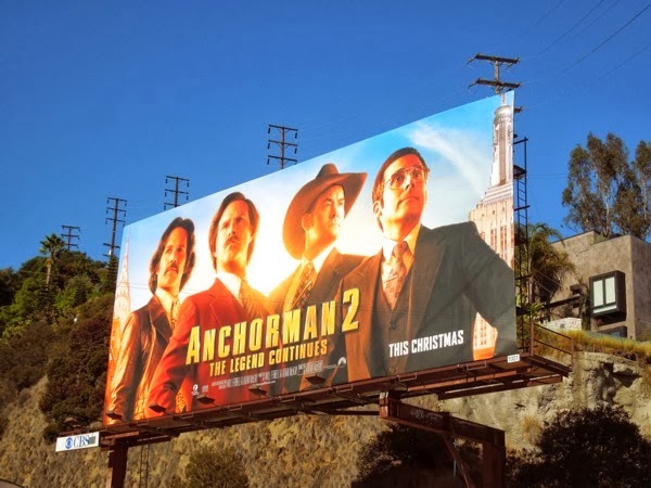
    Billboard adverts are also very popular with media with adverts common for TV, Films and Games. Here is an example for the movie: Anchorman 2.

    This advert differs from the Coca-Cola one as it takes a screenshot from the film but more importantly includes more information. Below the title of the film is the Paramount logo and the directors/producers/actors within the film. There is also a release window for the film stated as: This Christmas.

    Finally another example billboard I found was for Apple's iPad Mini. 


    This follows a similar idea to the Coca-Cola advert where it uses a minimalist style. The billboard is plain white and only includes an image of the iPad and the title of the iPad. This style is used because of the popularity that Apple has, they are that popular that they don't need to address what their product is. In terms of my product I will most likely have to go into more detail to describe what my product is due to the fact that my product will be much more unknown in comparison.