The evaluation for my coursework can be found at the following address: http://jameskay1996.wix.com/jky13
I decided to create a Wix website for my evaluation so that it is easier to read through than looking at individual blog posts. Also images and videos can be more easily embedded into Wix.
Sunday, 30 March 2014
Main Task - Magazine
After receiving some feedback I have made a slight few changes to my magazine. These changes include the following:
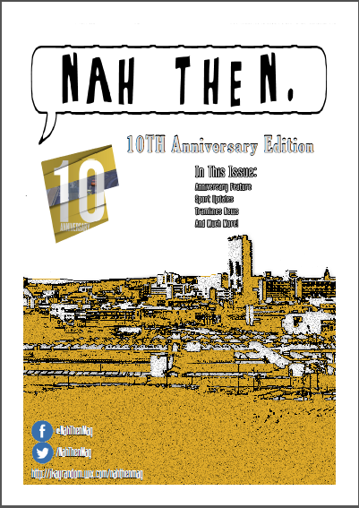
- Increased the "Nah Then" title to add more emphasis to it.
- Added page numbers at the bottom of each page in a speech bubble (only on anniversary special pages)
- Added website link near the social media links on the front cover
- Added speech bubbles to the anniversary page which add emphasis to a certain line within the written text.
Saturday, 29 March 2014
Ancillary Task - Website Updated
With all of my work that I have created it is important that I make improvements before finally regarding it as a final version. With my Ancillary Task I decided to ask for some advice from fellow classmates and I also my subject teacher. Everyone's input was extremely useful as we live in an age where we all use the internet so everyone in the class could quite easily tell if it was an effective website. The following feedback was given and these changes were made accordingly:

- The webpages contain a lot of white space, this made the webpage very boring for the user. I changed this on my updated website by adding the murky grey style background which is found on my billboard advertisement. I also decided to keep the repeat the theme of speech bubbles and add them to blend into my website by meshing them around the text I had.
- Too many pages. My subject teacher reminded me that in the checklist I only needed to have two webpages. I chose to keep the text I had on my extra page and merge the About Us and Latest Issue pages together.
- Added the same Facebook and Twitter design images to follow with the house style of my work.
My updated website can be found at the same address here.
Friday, 21 March 2014
Media Evaluation - Notes
Before I started writing my evaluation I began writing notes within class while talking with my teacher to give me a thorough understanding on what exactly I was writing for my evaluation. These notes can be found below:


Wednesday, 19 March 2014
Ancillary Task - Billboard Updated Version
After receiving feedback for my Billboard Advertisement I have decided to make changes based on the feedback I was given. Some of these were the following:

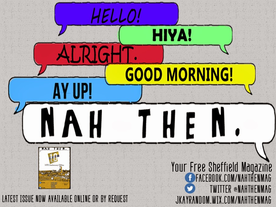
- Changed the font style for some of the other greetings other than "Nah Then". This was done to distinguish between the other greetings and the make the magazine title stand more.
- Made the "Nah Then" text bigger. This was again to make it stand out more from the other words to make sure the reader understands that "Nah Then" is the main focus of the advertisement.
- Added a screenshot of my magazine cover to show the audience my latest issue. This was an improvement suggested to me by my Media Teacher and also fellow students in my class.
- Added more social media and website links to help follow the house style, by adding these links it makes the advert and other work such as the magazine and website seem more like part of the same ecosystem.
I then asked for some final feedback on my work for some small improvement. I was suggested that I increased the size of each speech bubble, maybe even so they overlap in order to fill up some of the blank gaps between them. I also added the same Facebook and Twitter Logo that is found on my front cover in order to help with continuity and house-styles. Finally I also added a bit more text on where to find my magazine.
Tuesday, 11 March 2014
Main Task - Magazine
The following images are from my completed regional magazine task. The PDF document for the magazine can be found within the regional magazines website. This version isn't likely to be my final version as I will be receiving user feedback so that I can further improve my work to make it as good as possible.


Monday, 3 March 2014
Ancillary Task - Billboard Advertisement
As the other Ancillary Task I have chosen to create a Billboard Advertisement. Earlier Blog posts show the research I went into to look at existing examples of Billboard advertisements which gave me ideas and inspiration for my own. When creating the Billboard the advertisement it was important that I continued with my use of a house style, because of this I have used fonts that have been recurring throughout my work, with the main emphasis on the font used for "Nah Then". The advert is a simplistic design, the main focus is the distinguished "Nah Then" which is in white to stand out from the other words, this is to distinguish the fact that the other greetings are rather generic British greeting whereas "Nah Then" is a greeting which is found in Sheffield, which is where my magazine is based.

Thursday, 27 February 2014
Ancillary Task - Website
As mentioned earlier on in my Blog one of the Ancillary tasks I had been given told to complete was to create a website for my magazine, a companion piece to go with the magazine and billboard advertisement. I decided to create my website with the website creation tool site Wix rather than something than Dreamweaver as I feel the end product would be more superior.
My website that I created can be found here.

My website that I created can be found here.
Monday, 17 February 2014
Use of Multiple Fonts
A very important aspect of all of my coursework pieces is to keep to a house-style, all of my coursework pieces need to look like part of the same product. I have already maintained this with the introduction of a 10th Anniversary Logo that will appear in each of my coursework pieces. To follow on from this a simple but important part of keeping to a house-style is the use of fonts. If I were to switch fonts on each of my work then it wouldn't be following a particular house-style, because of this I have chosen to use a specific few fonts in my coursework pieces. In regional magazines I have researched their is commonly 3+ different fonts used, often a font for a heading, another for general text. I used the font website www.dafont.com and used free fonts to make sure I wasn't breaking any copyright laws, here are the fonts I chose:
For the title: Nammy Sans - Link
I chose this font due to the speech bubble effect it has, with the effect I could place my magazine name "Nah' Then" in the speech bubble to make it have the effect that it is spoken by someone.


For the title: Nammy Sans - Link
I chose this font due to the speech bubble effect it has, with the effect I could place my magazine name "Nah' Then" in the speech bubble to make it have the effect that it is spoken by someone.
For subheadings: TheReconLegend - Link
I have decided to use this font for subheadings. It has a unique style which stands out from other fonts I will be using. I decided to make this distinctly different from the font I will be using for most of my text so that readers can know that it is a subheading.
For general text: Defatted Milk - Link
This font will be used for all my general text. The font is rather thin I feel that it would be appropriate for general text but wouldn't suit a subheading or for the title.
Sunday, 16 February 2014
Anniversary Logo
For the design of the regional magazine I decided to make the particular issue I was designing a special edition issue, the occasion I chose was to commemorate the 10th Year Anniversary of the Magazine. By me designing a magazine like this it means I can have a general theme for my whole magazine content. When I decided to do an Anniversary issue I decided that I would like a particular logo which I could use throughout my main task (regional magazine) and also my ancillary tasks (billboard advertisement, website) as a form of keeping to a particular house style and theme.
I decided to create my logo on Photoshop, I followed a particular Youtube tutorial as I found that I am not skilled enough in Photoshop to create my own logo on my own. The video below is the video which I followed:
I decided to make sure my logo wasn't copying it completely I decided to change certain aspects, such as the font to suit my work and also the stock image in the middle to one which I had taken. I also decided to use a different font as well to give it my own signature touch. I used font which was copyright free known as "Bebas Neue" from dafont.com, a link can be found here.
After a while of trial and error with certain aspects and tools of Photoshop which I was not familiar with I finally ended up with a finished product and can say that I am relatively pleased with it. The following logo will be used on most of my pieces of work in order to assist in following a particular design house style.
Wednesday, 12 February 2014
Use of Wix for Ancillary Task
For one of my ancillary tasks for my coursework project I was given the task of creating a website for my magazine which will include atleast a Home page and an About us page. When given this task I was given multiple ways to how I could approach it in terms of what to use to create it. As I study IT I could choose to use Dreamweaver as a way to create my website, however in order for the website to be of a good level you have to be extremely skilled with Dreamweaver which I am not. Because of this I have decided to use a web based website creation tool, a tool which I can use via my web browser on any computer. Wix is the particular one I have decided to use as I have past experience with it, I used it for my Y12 Media Coursework assignment. I feel that because of my past experience I will be able to create a much more visually pleasing website than if I were to use Dreamweaver. It also has aspects of HTML5 which make the website extremely responsive and therefore improving the user experience, as HTML5 is quite a recent advancement in web coding Dreamweaver doesn't have the capabilities to include it.

My Y12 coursework website created with Wix can be found Here
The official website for Wix can be found Here
Thursday, 6 February 2014
Planning - InDesign Tutorials
For the creation of my magazine I will mainly be using two programs, Photoshop for the manipulation and editing of images and InDesign for the actual construction and layout of the magazine. I didn't really have much experience with InDesign so I decided to look on the internet for tutorial videos, I found one particular Youtube Channel who provide tutorial videos which have provided me with a lot of help with the construction of my magazine. The following channel can be found here: http://www.youtube.com/user/designlikeapro?feature=watch.
Thursday, 23 January 2014
Production - Image Editing
After taking the images in Sheffield I have began to edit them to make them more appropriate for my magazine. I didn't want to just use the plain unedited image as I felt that if I edited it on Photoshop it would be more visually pleasing, this would make the image look less of an image taken from a camera and more of a piece of art.
The following image I edited was an image of Sheffield which we took from a high place in order to give a better view to see all of the different places within Sheffield. I first started removing all of the sky as the sky was rather dull and I felt it didn't have much place in the image. After this I began to add effects and found a filter I thought worked well. After I applied this filter I then began to work on the colour, I found the orange style colour to work well with the effect.


The following image I edited was an image of Sheffield which we took from a high place in order to give a better view to see all of the different places within Sheffield. I first started removing all of the sky as the sky was rather dull and I felt it didn't have much place in the image. After this I began to add effects and found a filter I thought worked well. After I applied this filter I then began to work on the colour, I found the orange style colour to work well with the effect.
The colour is based upon another image I took while we were in Sheffield. The iconic Park Hill flats are a very large part of Sheffield, they are very easy to recognise therefore I thought that using the colours on the flats as part of a colour scheme would be an effective art style choice. This makes the magazine feel more personal to Sheffield as it refers to regional references with the flats. However if the reference isn't linked then it won't alienate readers they will just presume it is a random colour option chosen, however if they do see the reference they will see it has a deeper meaning.
Tuesday, 14 January 2014
Planning - Taking the Images for the Magazine Front Cover
This Thursday (16/01/2014) I have decided that I will be going to Sheffield to take Photos of different areas for use in the front cover of my regional magazine. I will be going with one of the other Media students in my class and together we will be travelling around Sheffield taking images of iconic places and locations. I will be using a Nikon DLSR as it as a professional camera and can take higher quality images than say that of a pocket camera. Once these images are taken I will then analyse them and find which images would be most appropriate for my magazine and then begin to edit them in Photoshop to then add it to the front cover of my magazine.
Thursday, 9 January 2014
Planning - Learning how to use Photoshop Effects
For my magazine front cover I will be using a combination of both Photoshop and InDesign. Photoshop will be used to edit each of my images on the front cover whereas InDesign will be used to create my layout of my magazine. Because of this I have found an online PDF document which focuses specifically on using filters and effects for Photoshop, these effects will be used to help create better looking images for the front of my magazine.
PDF Link: Here

PDF Link: Here
Tuesday, 7 January 2014
Planning - Taking Images of Buildings
For the images I will be using for the front cover of my magazine I have mentioned before I will be taking images of buildings and places within Sheffield. As I had not much experience on taking images of areas and places I decided to look on the internet for help and tips on how I can take better quality images of buildings. I found the following Wikihow webpage useful and it has given me tips which I will definitely use when taking my images.

Subscribe to:
Comments (Atom)